Environmental Portfolio
Scroll to View All Projects
Project Summary:
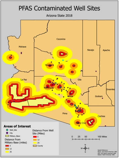
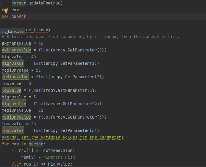
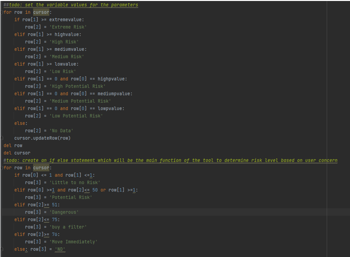
In collaboration with Ben Shackelford, a graduate with expertise in Environmental Science, we developed a GIS tool designed to assess and classify health risks associated with PFAS (Perfluoroalkyl and Polyfluoroalkyl Substances) contamination in groundwater. Leveraging my GIS skills and Python programming, this project addressed the critical environmental health challenge of PFAS contamination, specifically focusing on the state of Arizona. Our analysis revealed that all risk classifications exceeded the EPA's safe drinking water standards, which are set at extremely low levels (0.004 parts per trillion for PFOA and 0.02 parts per trillion for PFOS) to protect public health. The results highlighted the urgency of addressing PFAS contamination and provided a detailed risk map based on concentrations above these safety thresholds.
GIS Tool for Assessing PFAS Health Risks in Arizona
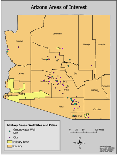
The map (above) offers a comprehensive overview of Arizona, including its counties. It features groundwater well sites marked with turquoise points, critical for data collection. The local cities are indicated by purple points, and the military bases are highlighted in yellow areas.
Objective and Methodology
Our primary objective was to create a user-friendly ArcGIS tool that leverages Python scripting to model and visualize PFAS contamination levels across Arizona. Utilizing data from 2018, which included tests for two primary PFAS chemicals (PFOA and PFOS), we designed the tool to provide actionable insights into potential health risks based on the proximity to military bases and PFAS concentrations in local water supplies. This was particularly relevant given the significant revisions to PFAS safety thresholds by the EPA in 2022, emphasizing the heightened risk posed by these contaminants.
Tool Functionality
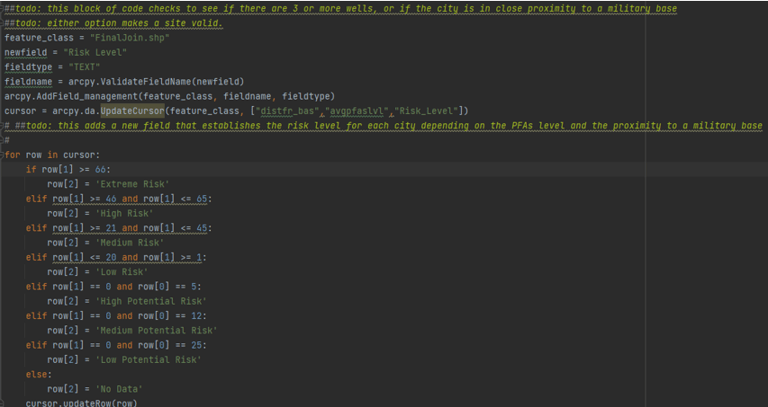
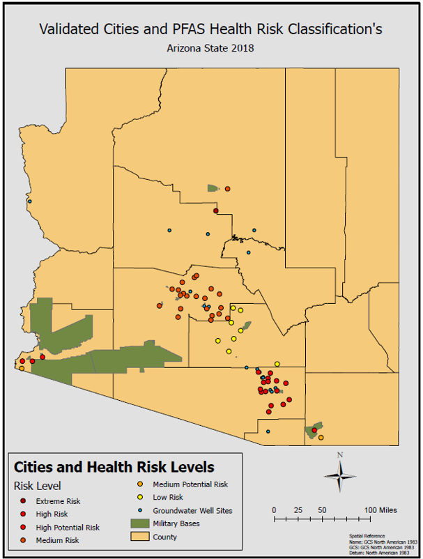
The tool categorizes PFAS risk into seven distinct levels, from "Low Risk" to "Extreme Risk," based on the concentration of PFAS in groundwater and the distance from potential PFAS sources like military bases. For example, areas within a 5-mile radius of a base are classified at a higher risk due to the prevalent use of PFAS-containing firefighting foams. Users can input their local PFAS levels to receive specific risk assessments and recommended actions ranging from testing water supplies to considering relocation for those in areas of extreme contamination.
Breakdown of Risk Classifications
Groundwater well site within 5 miles = High Potential Risk
Groundwater well site within 12 miles = Medium Potential Risk
Groundwater well site within 25 miles = Low Potential Risk
Groundwater well site with PFAS levels less than 20 PPT = Low Risk
Groundwater well site with PFAS levels between 21 and 45 PPT = Medium Risk
Groundwater well site with PFAS levels between 46 and 65 PPT = High Risk
Groundwater well site with PFAS levels above 65 PPT = Extreme Risk
The map (above) visually illustrates health risks based on the proximity to military bases and contaminated well sites.
Results and Conclusions
The GIS tool developed for this project successfully mapped the distribution of PFAS contamination across Arizona, highlighting areas of high, medium, and low health risks based on proximity to military bases and levels of PFAS in groundwater. Our analysis revealed that a significant portion of the groundwater well sites within five miles of military bases fell into the high potential risk category, underscoring the strong correlation between military activities and PFAS contamination levels.
Notably, the tool classified the cities in southern Arizona, where military bases are prevalent, as having higher risks. In contrast, central Arizona cities displayed moderate risk levels, while a few cities south of Tucson were categorized as low risk. This geographic distribution of PFAS risks highlights areas where community health initiatives and regulatory focus are urgently needed.
The results underscore the critical need for targeted public health responses and stricter regulatory measures to manage PFAS contamination. Additionally, this tool offers a valuable resource for other municipalities, counties, and residents to assess PFAS levels in their groundwater, enabling them to make informed decisions to protect public health and safety.
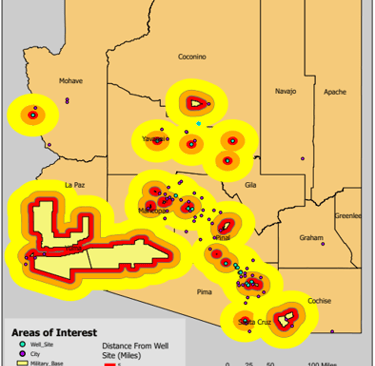
The map (above) provides a visualization of PFAS contamination levels, featuring buffer zones around military bases and well sites. These zones are integrated to show their proximity and overlap, aiding in understanding the relationship between PFAS presence and established safety standards set by the EPA.
This map is the result of a cartography project where I mapped the drought severity levels across the United States throughout 2021. Each month is represented by time-lapse animation, demonstrating not only the fluctuations in drought conditions but also showcasing my ability to visualize complex environmental data dynamically. The map you see here illustrates drought conditions, with color-coded regions indicating the intensity, from 'Abnormally Dry' (yellow) to 'Exceptional Drought' (dark red). Concentrated in the Western and Southwestern states, these conditions highlight significant environmental challenges. This visual tool aids policymakers, researchers, and the public in understanding and responding to the persistent drought issues.


Drought Severity Across the United States, January 2021
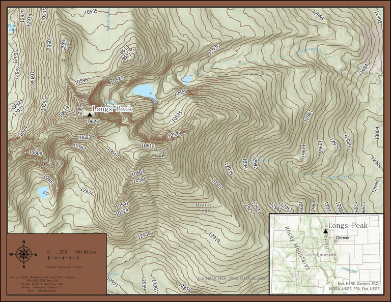
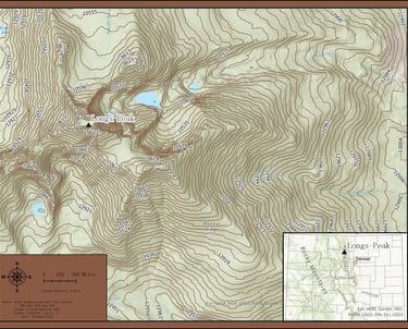
Contour Map of Longs Peak Area, Colorado (Left)
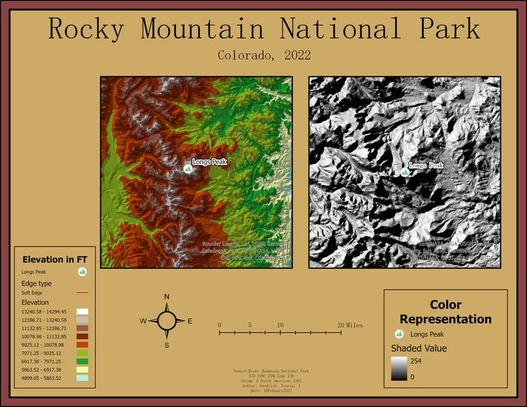
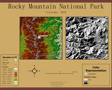
I created this map to illustrate a comparison between a basic shaded relief model and a color-coded Digital Elevation Model (DEM) of Longs Peak in Rocky Mountain National Park, Colorado. The shaded relief map on the right provides a monochrome visualization of terrain, emphasizing the topographic features through shadows and light. To its left, the color-coded DEM enhances these elevations with a range of colors, each representing different altitude levels for a more intuitive understanding of the landscape's physical contours.
Shaded Relief vs. Color coded Elevation Model (Right)
I created a contour map providing a detailed topographic representation of Longs Peak in Rocky Mountain National Park, Colorado. The map uses contour lines to depict elevation changes, with each line representing a specific altitude interval, giving a clear visual of the mountain's rugged terrain. Water bodies are marked in blue, enhancing the map's readability and emphasizing natural features. The inset map on the lower right shows Longs Peak's location relative to Denver, offering additional geographical context. This map is an essential tool for hikers, climbers, and geographical studies, offering both practical information and a deepened understanding of the area's topography.
Contour and DEM Mapping
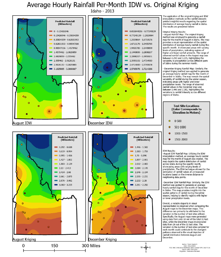
Spatial Analysis of Hourly Rainfall Patterns in Idaho Using IDW and Kriging Methods
This map represents a part of my research titled "Comparing Geostatistical Methods for Hourly Rainfall Mapping in Idaho: IDW vs. Kriging," where I explored the spatial interpolation of hourly rainfall data across Idaho using Inverse Distance Weighting (IDW) and Kriging methods. The project aimed to identify the most effective technique for predicting rainfall patterns, assess the impact of elevation on rainfall, and understand the distribution of rainfall throughout the year. By analyzing data from various weather stations, I was able to determine the months with the highest average hourly rainfall and compare these findings against historical weather data. The map visually represents these findings, showcasing differences in rainfall distribution influenced by geographical and topographical factors. This study not only enhances our understanding of Idaho's hydrological dynamics, but also assists in improving local water resource management and planning.
Analyzing Global CO2 and CH4 Emissions: Spatial Patterns and Trends
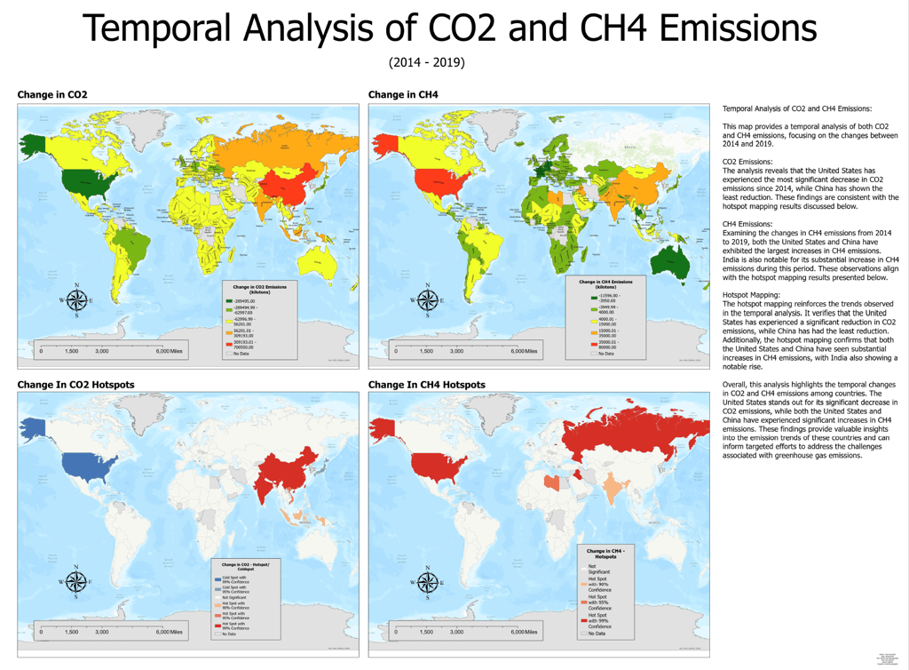
Summary of Temporal Analysis of CO2 and CH4 Emissions (2014-2019)
This map offers a detailed temporal analysis of global CO2 and CH4 emissions over the period from 2014 to 2019. It highlights significant changes in emissions patterns among key industrial nations, particularly focusing on the United States, China, and India.
CO2 Emissions:
The analysis indicates a notable decline in CO2 emissions in the United States, marking it as the country with the most significant reduction during this period. Conversely, China displayed minimal reductions in CO2 emissions, aligning with the global trends captured in the hotspot analysis.
CH4 Emissions:
In terms of methane, both the United States and China, showed increases in CH4 emissions, with India also registering a substantial rise. These trends are visually supported by the hotspot mapping, which indicates regions of intensified methane emissions.
In my Geographic Information Analysis course at the University of Denver, I embarked on an engaging project to map and compare global emissions of CO2 and CH4. The project's cornerstone was the utilization of advanced GIS statistical tools, specifically the Getis-Ord G tool, to identify and visualize hotspots of emissions. This technique allowed me to detect significant spatial clustering of emissions data, providing a deeper understanding of the regions with intense emission outputs. The maps created from this analysis offer a visual depiction of areas with disproportionately high levels of CO2 and CH4, serving as a crucial tool for researchers and policymakers aiming to target and mitigate environmental impacts effectively.
Hotspot Analysis:
The hotspot maps reinforce the findings from the temporal analysis. They confirm the significant decrease in CO2 emissions in the United States and the lesser reductions in China. For CH4 emissions, the hotspot maps reveal major increases in the United States and China, along with noteworthy increases in India.
Conclusion:
This comprehensive analysis underscores the dynamic nature of global emissions over the five-year period. The United States has made notable progress in reducing CO2 emissions, while both it and China have faced challenges with rising methane levels. These insights are crucial for understanding the emission trends and developing targeted environmental policies to mitigate the impacts of these greenhouse gases effectively.
This summary encapsulates the critical findings from the temporal analysis and provides a clear perspective on how major countries are progressing in managing their emissions.
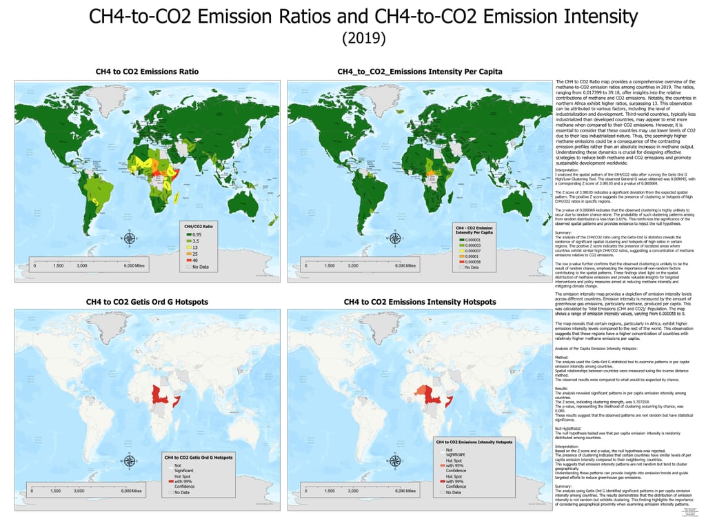
Summary of CH4-to-CO2 Emission Ratios and Emission Intensity Analysis (2019)
The map (right) analyzes global CH4-to-CO2 emission ratios and emission intensities per capita for the year 2019. The study highlighted distinct spatial variations in emission ratios and intensities, with significant findings noted particularly in northern Africa and other third-world countries.
Emission Ratios:
The CH4 to CO2 Emissions Ratio map (Top Left of Layout) revealed that countries in northern Africa exhibited notably higher methane-to-CO2 ratios, exceeding a ratio of 13. This is largely attributed to lower industrialization levels affecting CO2 emissions, thereby elevating the relative methane emissions.
Emission Intensity:
The analysis of emission intensity per capita across different regions (Top Right of Layout) showed higher values in parts of Africa, suggesting a higher per capita emission of methane relative to CO2. This indicates a significant environmental impact that could necessitate targeted emission reduction strategies.
Conclusion
This comprehensive analysis of global CH4-to-CO2 emission ratios and per capita emission intensities has provided insights into the spatial distribution of greenhouse gases for 2019. Particularly noteworthy are the high methane-to-CO2 ratios observed in northern Africa and other less industrialized regions, which call for targeted emission reduction strategies. The identification of emission hotspots underscores the need for region-specific environmental policies that address the unique challenges posed by varying levels of industrialization. This project lays a solid groundwork for future efforts aimed at reducing greenhouse gas emissions and fostering sustainable global development.
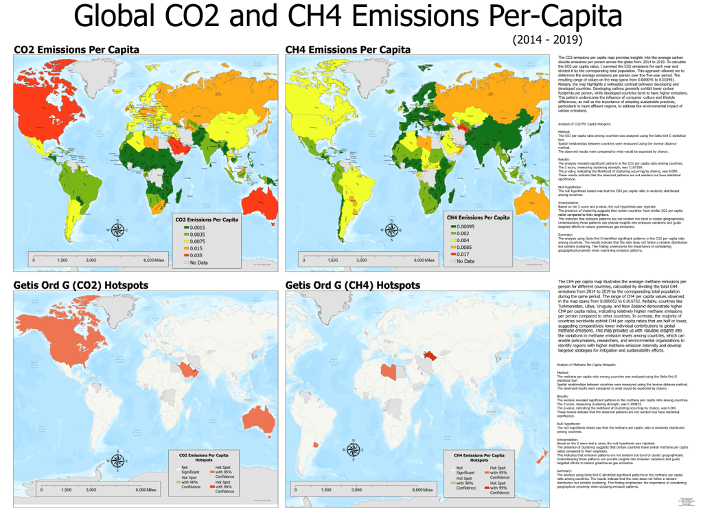
Global Analysis of CO2 and CH4 Emissions Per Capita (2014-2019)
The map (Right) presents a comprehensive overview of global carbon dioxide (CO2) and methane (CH4) emissions per capita from 2014 to 2019, using advanced GIS tools to map and analyze emissions trends across different countries. The analysis provided valuable insights into the per capita emissions of these potent greenhouse gases, reflecting significant geographical and economic variations.
CO2 Emissions Per Capita:
The CO2 emissions per capita map (Top Left of Layout) reveals patterns where developed countries typically exhibit higher emissions per person compared to developing countries. This discrepancy is attributed to the higher levels of industrialization and consumer lifestyle in more affluent regions, highlighting the need for targeted sustainable practices to mitigate environmental impacts.
CH4 Emissions Per Capita:
Similarly, the CH4 per capita map (Top Right of Layout) illustrates notable variations, with countries like Russia, Turkmenistan, Libya, Uruguay, and Oman showing significantly higher methane emissions per person. These results suggest a correlation between specific economic activities and higher methane emissions, which are crucial for formulating localized mitigation strategies.
Conclusion:
The temporal and spatial analysis of CO2 and CH4 emissions per capita from 2014 to 2019 highlights crucial trends and hotspots that are instrumental in understanding global emissions dynamics. The identified patterns underscore the importance of considering geographical and economic contexts when addressing greenhouse gas emissions. Policymakers and environmental organizations can use these insights to prioritize interventions in regions with high emissions intensity, thereby enhancing the effectiveness of global sustainability efforts. This study not only provides a clear picture of current emission trends but also sets the groundwork for future research and policy planning aimed at reducing global greenhouse gas emissions.
